The choice of floral colors for a wedding involves much more than an aesthetic preference. Seasonal availability, consistency with the reception venue, and the origin of the flowers: each parameter influences the final palette. The color of flowers for a wedding is determined by balancing these constraints, rather than by flipping through an isolated color chart.
Flower Color and Local Sourcing: An Underestimated Constraint
Most floral guides present color as a free choice. In practice, the French horticultural sector imposes concrete limits. France imports the vast majority of cut flowers consumed within its territory, and specialized domestic production remains limited.
For engaged couples who want flowers grown in France, the available palette varies by region and time of year. The demand for local flowers sometimes exceeds supply, meaning that a specific color required in quantity may simply not be available on the desired day.
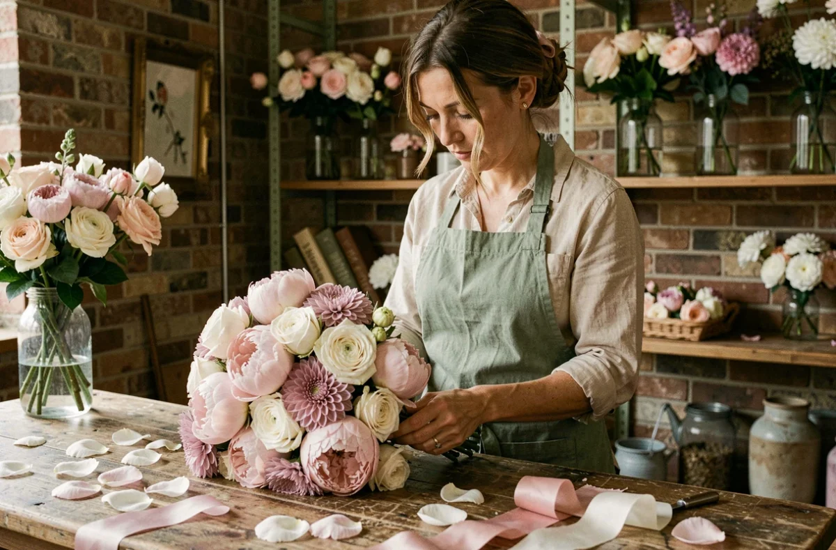
Defining your palette by broad tones (warm tones, powdery tones, bright tones) rather than by a single variety and shade makes it easier for the florist who sources locally. You can find flower advice on Le Blog Mariage to explore different shade combinations suitable for each season.
Floral Palette and Wedding Season: What Climate Really Changes
Choosing pale pink peonies for a wedding in September exposes you to additional costs related to importation or disappointment regarding freshness. The season dictates the range of colors that are actually accessible, not the other way around.
Spring and Early Summer
Pastel tones naturally dominate: soft pink peonies, cream white ranunculus, lavender lilacs. The foliage is young, a light green that harmonizes with soft palettes.
High Summer and Early Autumn
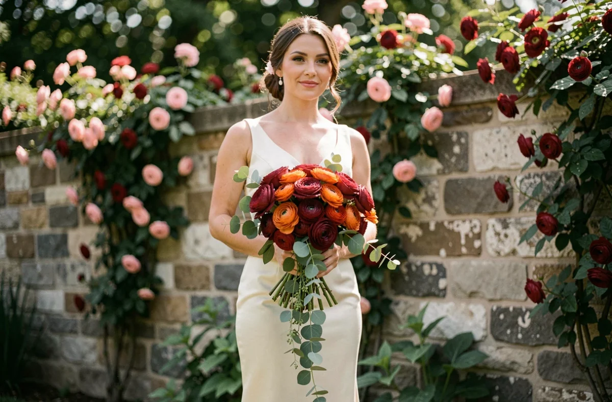
Saturated colors take over. Burgundy dahlias, intense yellow sunflowers, orange zinnias: nature spontaneously offers warm and bold shades. A wedding in August aiming for an exclusively white palette would have to contend with fewer varieties available in local production.
Weather Uncertainties and Backup Plan
A palette chosen long in advance can be compromised by weather uncertainties. A heatwave or excessive rain alters production, even among growers equipped with drip irrigation. Planning for two or three substitute flowers in the same tones is not a florist’s whim; it’s a practical precaution against the unpredictability of harvests.
Flower Color and Reception Venue: Matches and Pitfalls to Avoid
A beautiful bouquet in a photo can visually disappear in a setting that absorbs its hues. The color of the walls, furniture, and lighting of the venue alters the perception of the flowers.
- A space with light stone walls (château, Provençal farmhouse) highlights warm tones and bright colors but overwhelms pure whites that blend into the stone.
- A modern reception hall with dark or metallic surfaces requires bright compositions (yellow, coral, white) to create contrast.
- A garden or open tent exposes flowers to changing natural light: pastel tones gain softness at dusk, while deep reds lose readability at sunset.
Visiting the venue at the approximate time of the reception allows you to test the actual light. A photo taken on-site with a fabric sample in the intended shades gives the florist a reliable reference.
Responsible Wedding Flowers: Color Says Nothing About Growing Methods
A bouquet of white roses can come from a heated greenhouse in the Netherlands or from an open-field grower in southern France. Appearance does not reveal the ecological footprint of a flower.
Growing in heated greenhouses or artificially lit environments can weigh more heavily in the carbon footprint than transportation itself. Two roses of the same color, purchased from the same florist, can have very different environmental footprints depending on their journey.
The Fleurs de France label allows you to identify flowers grown within the national territory. Asking the florist about the origin and production methods provides information that color alone does not supply. Inquiring about the origin of the flowers is as relevant as choosing their shade.
Building Your Palette in Three Tones: A Practical Method
Instead of starting from a single color and trying to impose it everywhere, an approach using three tones offers flexibility without sacrificing coherence.
- A dominant color (the main shade of the bride’s bouquet and table centerpieces) that represents the majority of the visible floral volume.
- A secondary color (complementary or adjacent on the color wheel) that adds depth to ceremony arrangements and room decoration.
- An accent color (brighter or darker) used in touches for boutonnieres, small arrangements, and stationery.
Three tones are enough to create a coherent atmosphere without rigidifying the florist’s work. This method allows the necessary margin to incorporate the varieties that are actually available on the delivery day.
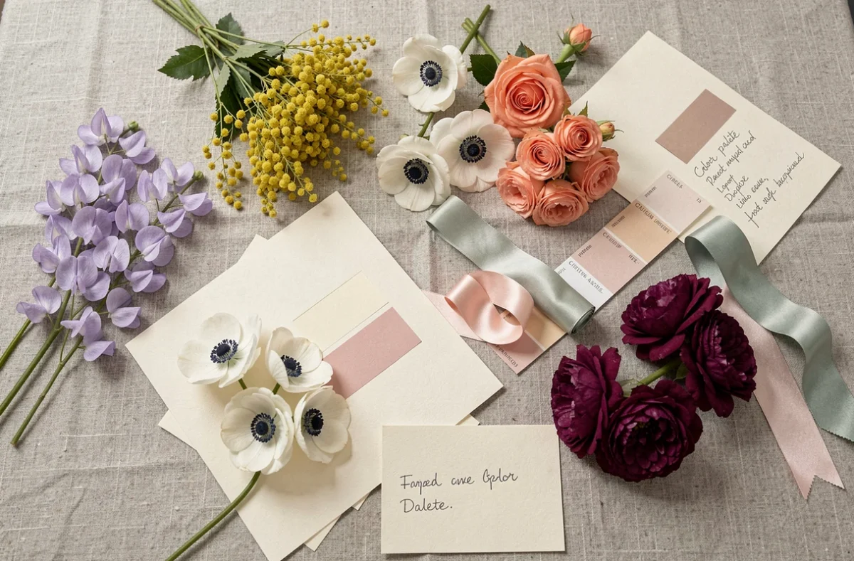
Communicating this palette to the florist in the form of fabric samples or Pantone references provides a more reliable framework than a selection of Pinterest photos, where filters systematically alter the actual colors. A physical sample is worth more than ten filtered images to align the expectations of the couple and the final result.
The perfect color for wedding flowers does not exist in absolute terms. It is built from the venue, the season, local availability, and a precise dialogue with the florist. Accepting a flexible palette, defined by tones rather than fixed varieties, remains the best guarantee of a floral result worthy of the day.